The Pantone Color Institute has announced the Pantone Color of the Year for 2021 as:
| PANTONE 13-0647 Illuminating | + | PANTONE 17-5104 Ultimate Gray |
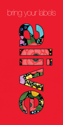
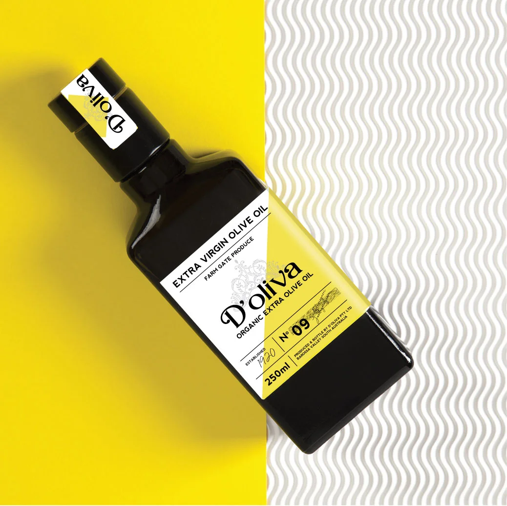
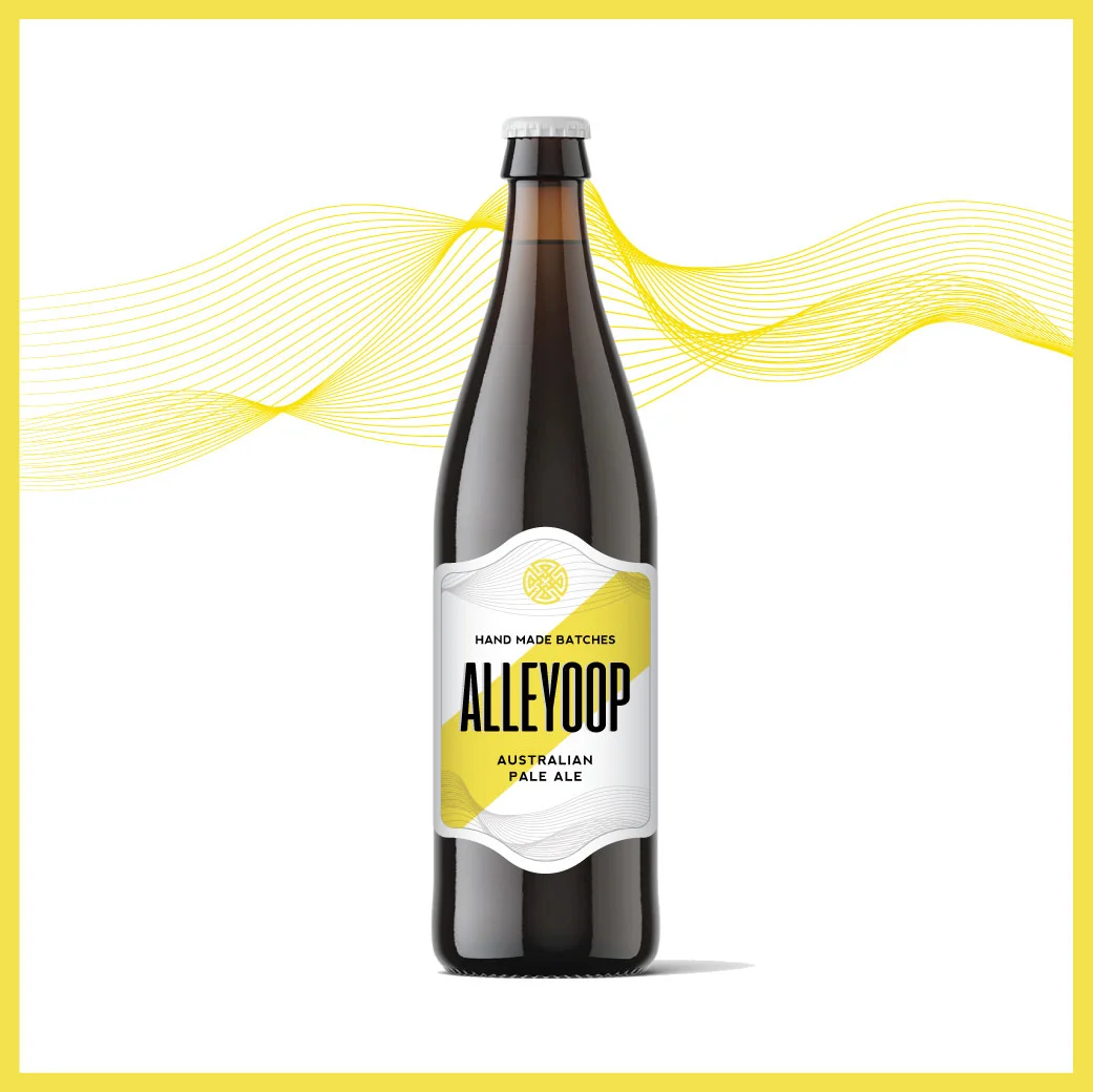
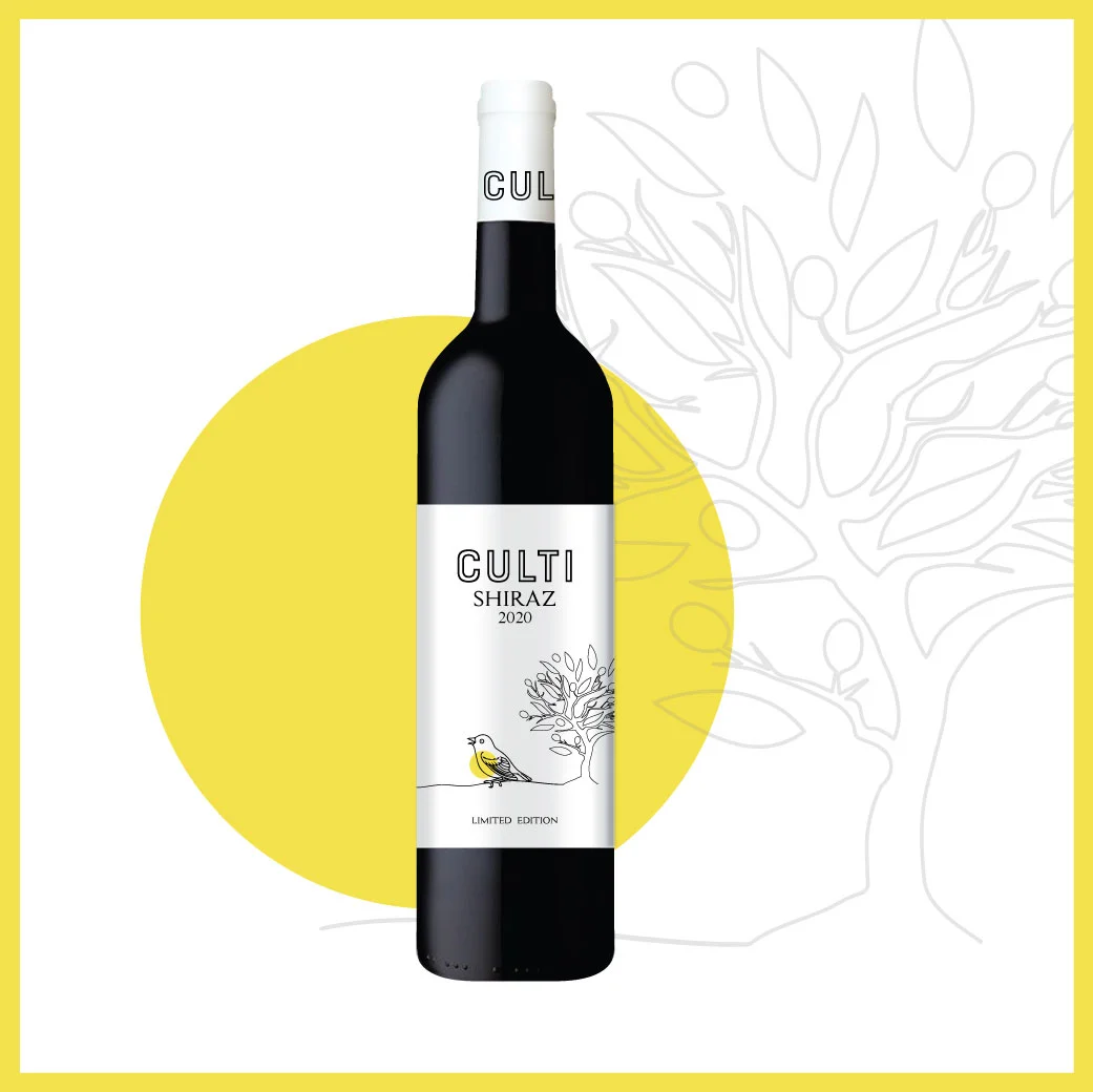
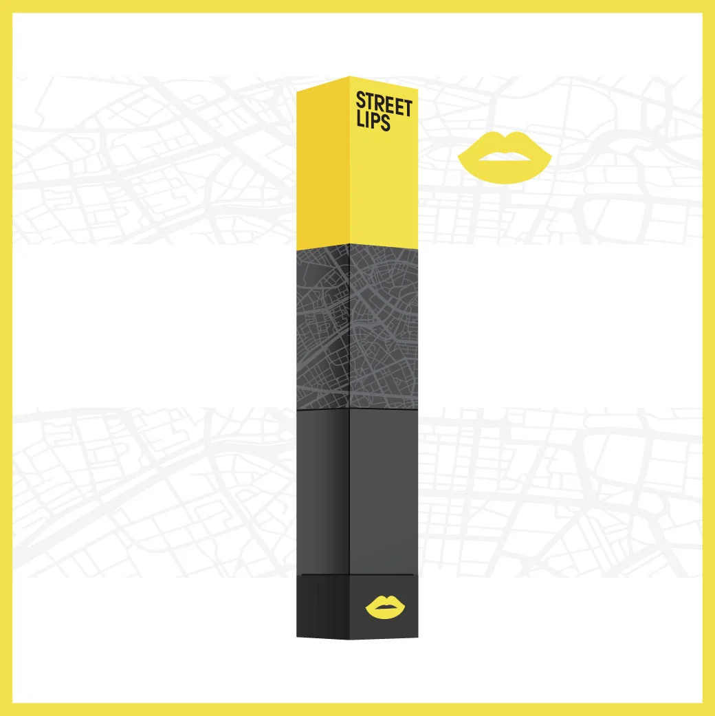
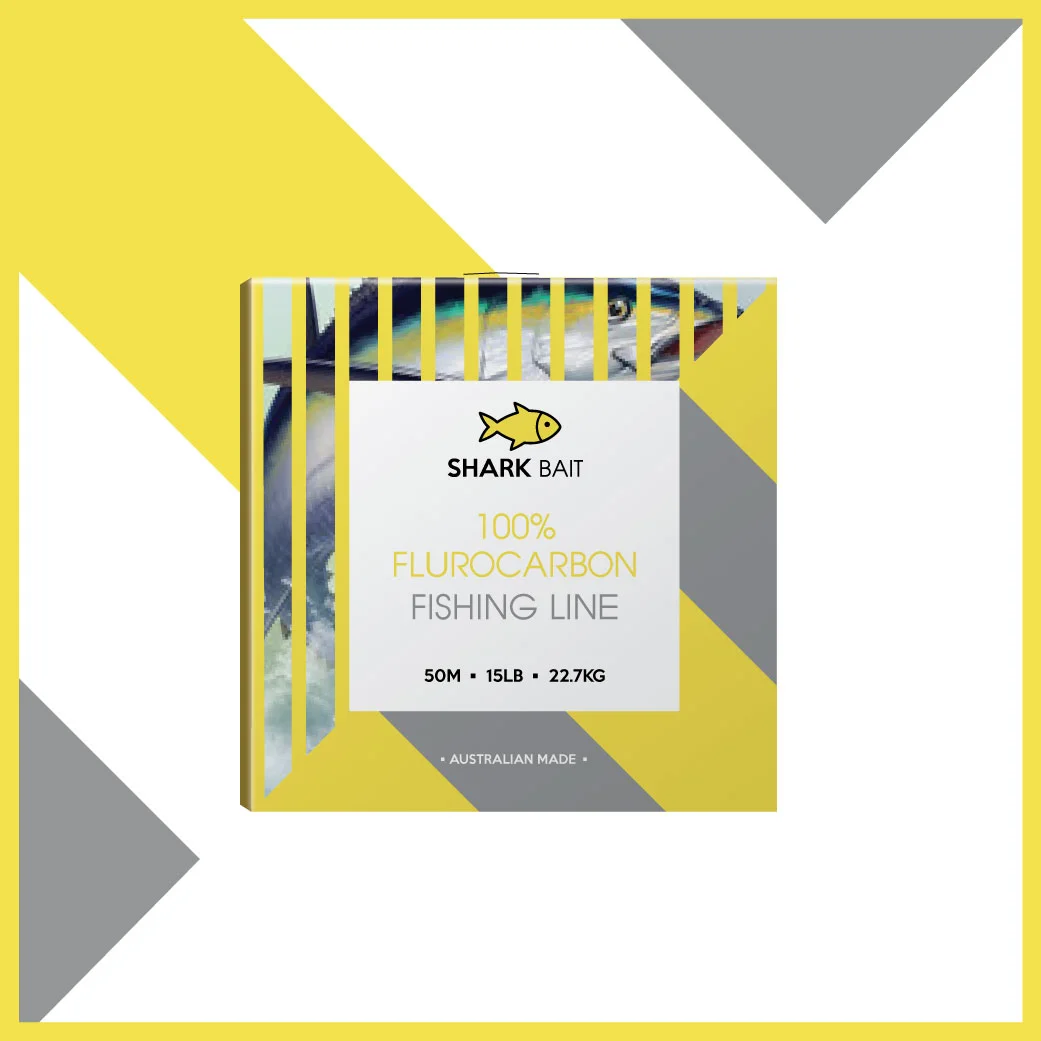
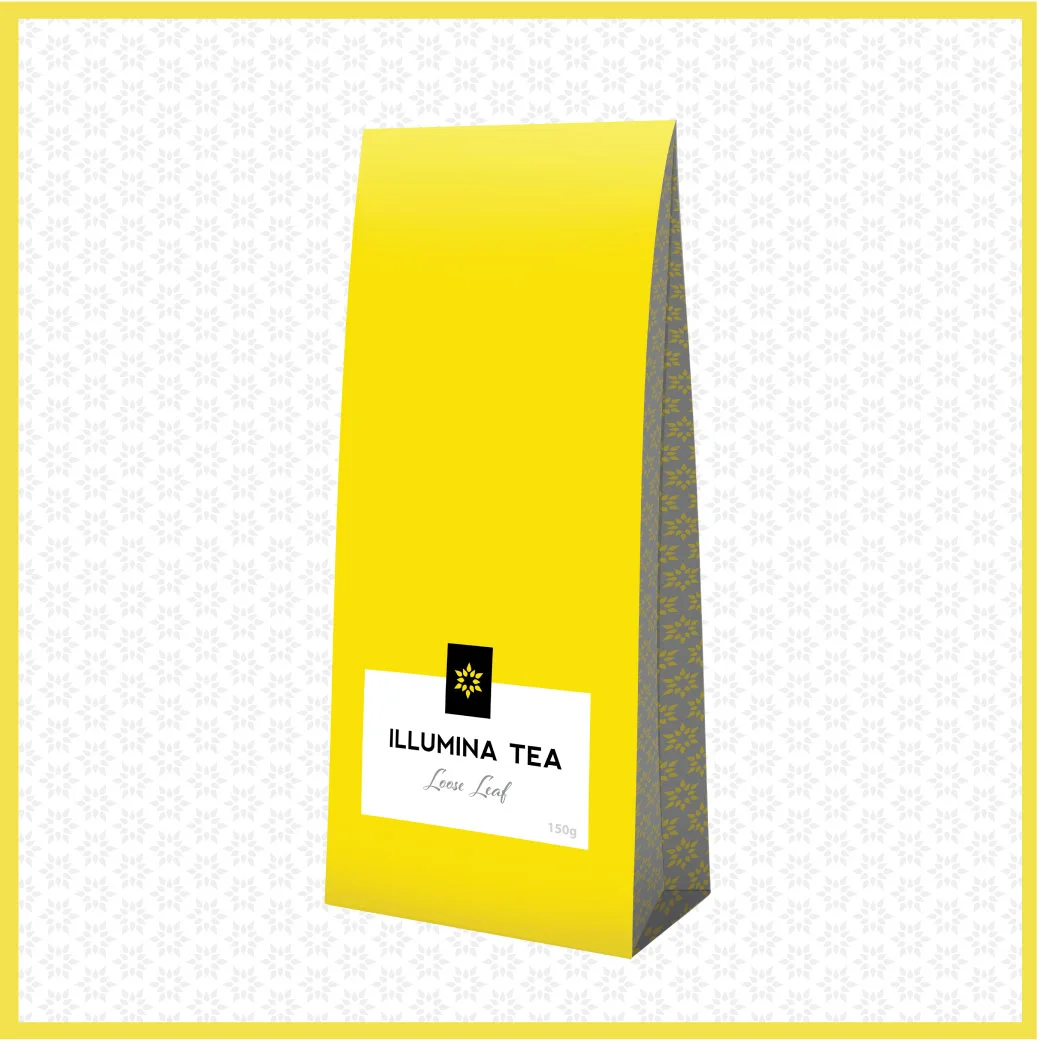
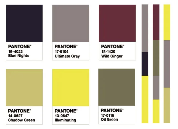
USING ULTIMATE GRAY + ILLUMINATING IN LABELS, PACKAGING AND DESIGN
 | Described as “A marriage of colour conveying a message of strength and hopefulness that is both enduring and uplifting”, for 2021 two independent colours: PANTONE 17-5104 Ultimate Gray + PANTONE 13-0647 Illuminating have been chosen to come together and support one another in what is expected to be another challenging year, but one filled with hope. |
 | Ultimate Gray represents a practical and solid tone (strength), while Illuminating is a warm and optimistic tone (hope). It is that beautiful combination of brightness and energy combined with a stability that combines the earth and the sun elements. As Pantone describe it “We need to feel that everything is going to get brighter – this is essential to the human spirit”. |
 | Pantone’s Color of the Year influences product development and purchasing decisions across many industries, from fashion to furnishing, industrial design, product packaging and graphic design. It isn’t just about setting ‘trends’ – it conveys the power, psychology and emotion of colour as a tool for designers and brands to incorporate this into their designs. |
 | Want you to have fun and explore the Pantone 2021 Color of the Year? There are a bunch of things, from Facebook and Instagram filters, to building and sharing palettes featuring the latest colour trends from around the globe. Be sure to check out the PANTONE site links below and share your designs using the hashtags #Pantone2021 #coloroftheyear Pantone Color of the Year 2021
|
 | The brightness and visibility of Illuminating, combined with the stability and base value of Ultimate Gray present many opportunities for striking designs. We are already seeing brands apply these to their designs. Remember, utilising the Color of the Year combinations is not about a gimmick, carefully consider how these colours work in with your branding to create feeling and connection. |
 | Also explore Pantone Connect – a digital colour platform for designers on available on the web where you can share, save and use Color of the Year themed palettes to find inspiration colour combinations and design options. |
how to use the Pantone colour of the year 2021
Pantone have created five unique color palettes featuring PANTONE 17-5104 Ultimate Gray and PANTONE 13-0647 Illuminating to help you bring this year’s special shades into your designs. Each palette conveys a different mood, illustrating the versatility of Ultimate Gray + Illuminating, and is supported by three suggested color combinations… or visit the Pantone site to see more
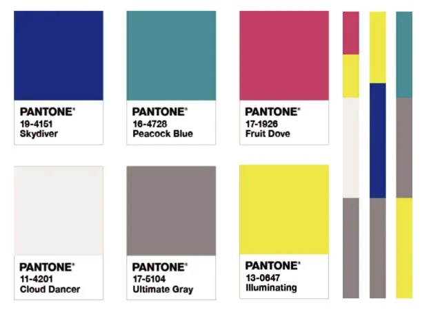 | AVIARY Aviary is a lively and joyful grouping of color emblematic of vibrant and eye-catching rich bird plumage. PANTONE 17-5104 Ultimate Gray brings a natural element to this upbeat palette of cheery brights that includes PANTONE 13-0647 Illuminating, while the contrast of a lofty white PANTONE 11-4201 Cloud Dancer injects drama. |
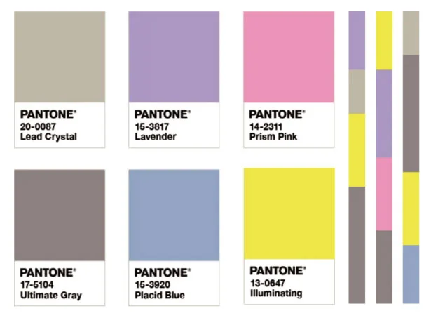 | ENLIGHTENMENT Evocative of a hypnotic space that expands our mind into another realm, the youthful and future facing color story in Enlightenment stimulates our desire to reimagine. The pairing of PANTONE 17-5104 Ultimate Gray and PANTONE 13-0647 Illuminating blends wisdom and experience with our desire to press forward toward new ways of thinking and reveal new insights, while a silvery metallic PANTONE 20-0087 Lead Crystal adds a moonlight shimmer. |
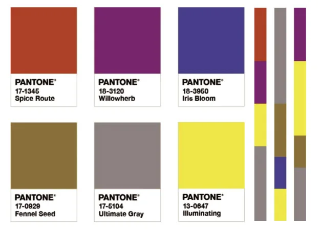 | INTRIGUE A captivating potpourri of colors, Intrigue embraces a fusion of influences. Quirky and vigorously individualistic, yet at the same time displaying a universal appeal, the seasonless endurance of Intrigue is heightened by the addition of the solid and dependable PANTONE 17-5104 Ultimate Gray and the bright yellow PANTONE 13-0647 Illuminating, a yellow tone symbolic of sunlight. |
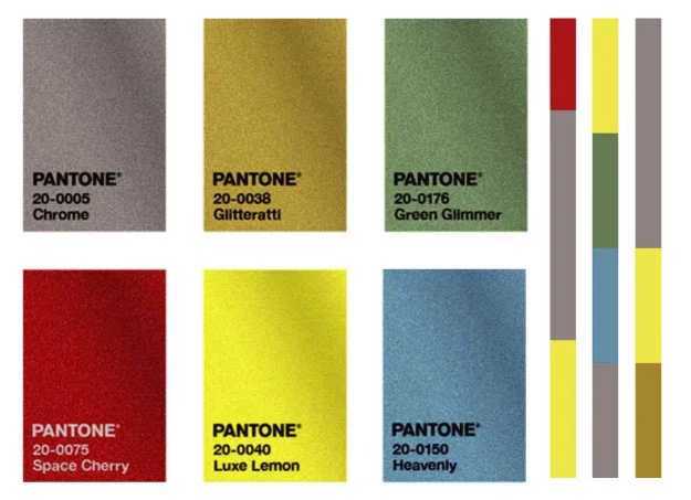 | ORBITAL The fervor to explore interstellar travel is reflected in Orbital, a palette of shimmering metallic tones found in the mesmerizing galaxies of outer space. The golden image of PANTONE 20-0040 Luxe Lemon sparkles with vitality while PANTONE 20-0005 Chrome mimics the glimmering radiance of the stars. |
 | SUN AND SHADOW Resilient PANTONE 17-5104 Ultimate Gray and hopeful PANTONE 13-0647 Illuminating inject strength and positivity to a palette of earthbound shades. Ageless and genderless, the color story in Sun and Shadow conveys a narrative of the primitive beauty that surrounds us. |