Bright Pastels are trending in 2022
Pastels trend in and out quite frequently, but there is an exciting change that is happening: Bright Pastels.
Sometimes referred to as “eccentric pastels” or ‘adventurous pastels’, Bright Pastels present pastels in unconventional ways, evoking new sensations to disrupt our traditional view while still remaining true to their familiarity & calmness.
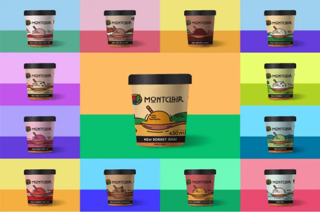 |
| Source: Annam Gourmet & Purple Asia |
So – why do we love pastels?
Pastels have a joy and lightness that is kind of mystical. Their colours are usually yellows, greens, blues, pinks and purples with really exciting names like lemon, apricot, pistachio, mint & lavender.
The soft, chalky and muted palettes are traditionally associated with spring, newness and energy. The colours by themselves tend to evoke a soft, playful feel, and as such are often used on children’s products, cleaning products and cosmetics.
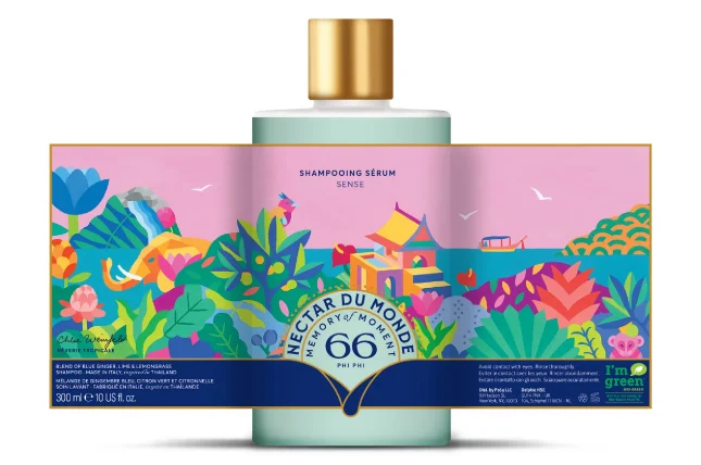 |
| Source: Nectar du Monde |
But sometimes, they need a little kick with some added punch, creating combinations that bring a new vitality or freshness to designs across a much broader range of products. Pastels are a diluted version of a primary or secondary colour, created by adding white. They are a ‘tint’ or diluted hue. Retaining the vibrancy of their original colour but the white seems to make it ‘fresher’. And this is why Bright Pastels are booming.
Pastels really come into their own when used in combination with other colours creating more complex and dynamic designs for a broader range of designs & products.
But pastels are not just for cosmetics, baby products. They are seeing life in new products like protein powders, craft beer and spirits, health foods, ice-cream and gelato, as well as products like tea, candy, beverages & cleaning products.
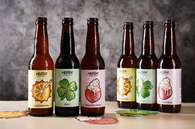 |
| Source: Mixtape |
Colour is an incredibly important tool for designers. It stimulates reactions and emotions, while influencing buying decisions through style and tone!
Pastels have arguably never really gone out of fashion but ebb and flow. Their optimism and colour positivity has become more important than ever before as we’re drawn to colours that combine and clash with contrasting shades and patterns.
So, if you are a brand that doesn’t usually use pastels, you may want to consider them as a way to differentiate yourself and stand out. While shelves are full of products ‘shouting’ for attention, sometimes a calm in the storm can be a way to catch the eye of consumers.
Talk to us today to make your labels alive, with whatever design that you have in mind.
