The Inside Out trend, sometimes referred to as ‘Minimal Outside – Maximum Inside’ (or a variation of this), uses creative or innovative designs and messaging to build excitement and elevate the experience when packages are opened. With the shift to mass delivery of products through online purchasing, many consumers miss the sensory gratification that comes from visiting an actual store. This provides a unique opportunity to build in ‘experiential elements’ with packaging, giving brands a way to engage and delight customers in the privacy of their own spaces.
‘Delayed gratification’ and ‘surprise’ are central to the Inside Out trend. This is achieved when branding on the outside of packaging applies a form of controlled minimalism. Minimalistic outer designs are often popular with both brands and consumers as they provide a consistent branding identity and are aligned to cost control and/or the limitations of printing capabilities for tertiary packaging.
Inside Out is psychologically different to elaborately wrapped gift experiences where the packaging builds hype and then continues with the actual gift inside. The Inside Out technique makes you wait, using inner elements to generate different ‘feelings’ based on the way it is designed with colour, form and messaging.
Inside Out builds on the ‘unboxing experience’ phenomenon, where consumers record and share the moment they open a package from something purchased (often online, but not always). It is being increasingly used as a way to reinforce identity, values and a sense of alignment with a brand, company or product. It sometimes isn’t about what is shared, but what is felt by the consumer in that moment. The notion that it is just for the Tik Tok generation ignores an incredible opportunity where ‘purchases’ are usually done by the end consumer, even though it mimics the emotion of opening a present from someone else.
The best ways to achieve the INSIDE-OUT phenomenon:
BUSINESS OUTSIDE – PARTY INSIDE | |||
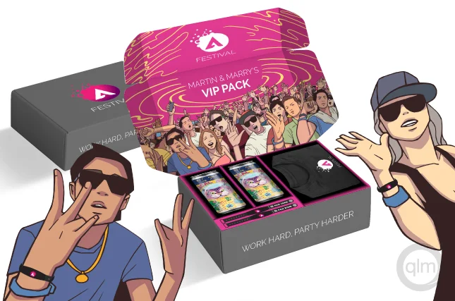 An extension of a tested ‘business card’ technique where a generic ‘Business UpFront’ style is contrasted with a ‘party on the back’. It allows for conservative branding to be retained on the exterior or front facing part of the design, while surprising recipients with expressive designs on the back or inner areas. | |||
COLOUR & OCCASION | |||
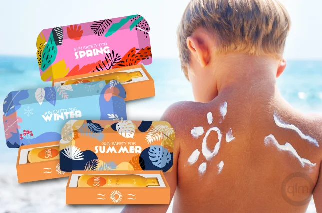 Colour is an excellent way to achieve impact. Simplistic or monochromatic designs on the outside stabilise expectations allowing for creative and colourful inner elements to stimulate and engage other senses and emotions. A creative way to do this is to use images, colours, patterns or designs that reflect an occasion, event or ‘season’. | |||
PERSONALISATION & MESSAGING | |||
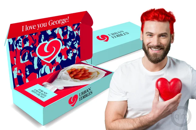 Adding personalised messages, helpful or insightful elements that are tailored to what the consumer has purchased or may be interested in creates a perception that you are paying attention to their needs and makes them feel connected. Be mindful of messages that look like ‘automation’ or machine-made responses. | |||
LAYERS TO SHARE & SHARE A(LIKE) | |||
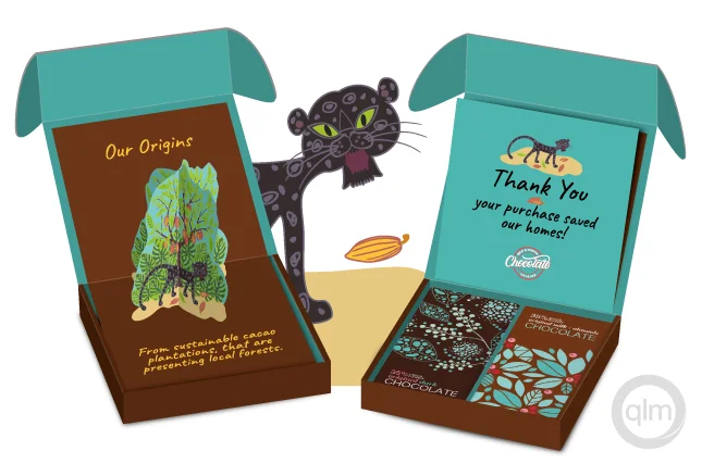 Packaging with multiple parts works on a number of levels including allowing for that more or ‘extra’ feeling. Hiding things or using layers or extra secondary packaging allows the consumer to keep discovering. It extends the feeling of euphoria but shouldn’t be cumbersome or people will become frustrated rather than excited. | |||
COUPONS & SAMPLES | |||
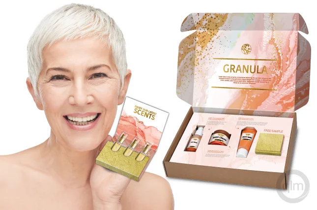 An extremely popular element of many deliveries is FREEBIES! Adding samples, coupons or bonus extras doesn’t need to devalue the perception of your company. Complementary & complimentary products can actually increase a consumer’s awareness of your product range and give them a greater alignment with your brand. | |||
Enjoy using INSIDE OUT to create some innovative and heartfelt moments with your customers. Be sure to check back to see our next trend soon. Want to explore more? Contact QLM Group to get answers for every question that you have.


